
By Anand Pai V
A chart can contain correct numbers and still give you an exaggerated first impression. Before repeating its headline, recover the comparison in a sentence: what was measured, for whom, over which period, and in what units?
You can practise this without advanced statistics. Start with the axis, write down the values, and calculate the change yourself. An AI-generated description should go through the same check as any other caption.
Recover the values before judging the picture
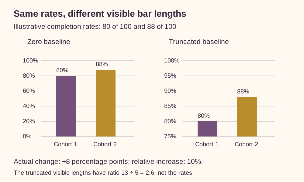
Consider a fictional training programme with two cohorts. In the first cohort, 80 of 100 learners complete the course. In the second, 88 of 100 complete it. The completion rates are therefore 80% and 88%.
Suppose a column chart shows these rates with its vertical axis starting at 75%. The first visible column extends 5 percentage points above the baseline; the second extends 13. The second visible length is 13 divided by 5, or 2.6 times the first.
The completion rate did not become 2.6 times as large. The visual ratio came from measuring only the portions above 75%. The actual rate ratio is 88 divided by 80, or 1.10.
Write the two values beside the chart before deciding whether words such as “surged” or “doubled” fit.
Match the baseline to the visual encoding
Bars use their lengths to represent amounts. A zero baseline preserves those length comparisons: a bar representing 88 should be 1.10 times the length of a bar representing 80. The UK Office for National Statistics recommends starting bar-chart axes at zero. ONS guidance on axes
A line chart works differently. Its points show positions on a scale, so a clearly labelled, shortened vertical range can help readers inspect small changes. A nonzero baseline is therefore not sufficient evidence that a line chart is misleading. Read the tick labels and ask whether the caption communicates the size of the change accurately. ONS guidance on axis start points
For our completion example, zero-based bars work well. If the purpose is to inspect a narrow range of rates, a dot plot with a clearly labelled scale is another option. ONS guidance on bar-chart alternatives Never infer the values solely from apparent height.
Calculate both kinds of change
The absolute difference between the two completion rates is 88% minus 80%: 8 percentage points. A percentage point is the difference between percentages. ONS guidance on percentages
The relative increase compares that difference with the starting rate: 8 divided by 80, multiplied by 100, gives 10%.
Both descriptions are valid when their units are clear:
- Completion increased from 80% to 88%, a rise of 8 percentage points.
- Completion increased by 10% relative to the starting rate.
“Completion increased by 8%” would describe a different calculation. An 8% relative increase from 80% reaches 86.4%, because 80 multiplied by 1.08 equals 86.4.
Keeping the starting and ending values in the sentence makes the comparison easier to check.
Try a chart audit
Here is a second fictional example. A workshop organizer sends 200 invitations and records 40 registrations in April. In May, the organizer sends 240 invitations and records 60 registrations. A chart of registration rates begins its vertical axis at 18%. Its headline says, “Registration rate jumps 50%.”
Before reading the answer, work out:
- The registration rate in each month.
- The percentage-point change and the relative percentage change in the rate.
- What increased by 50%.
- A replacement headline and one change to the chart.
Check the answer
April's rate is 40 divided by 200, or 20%. May's is 60 divided by 240, or 25%. The difference is 5 percentage points; the relative rate increase is 5 divided by 20, or 25%.
The registration count rose by 50%, from 40 to 60. The invitation count also changed, so that count increase cannot be substituted for the rate increase.
A clearer headline is: “Registration rate rises from 20% to 25%.” For bars, reset the baseline to zero. At an 18% baseline, visible lengths of 2 and 7 percentage points make the second bar look 3.5 times as long.
Before sharing the chart, keep its source, dates, units, and denominator visible. A useful caption gives readers enough information to reconstruct the claim.