Statistics with Data Storytelling
Aabha AI Academy · Foundation course · Review edition 2026-10-14
Purpose and prerequisites
Learn to ask a statistical question, check the evidence, quantify a meaningful difference and communicate a recommendation with honest uncertainty. The course is for beginners who can use rows and columns, divide numbers, interpret a percentage and save a file. No calculus, SQL, Python or prior statistics is required for the core reading-and-calculator route.
A useful readiness check: calculate 15/60 as a percentage; explain why one customer can have several orders; and distinguish an unknown rating from a rating of zero. Answers: 25%; an order-grain table can contain repeated customer IDs; unknown supplies no rating value. If these are unfamiliar, begin slowly with Lesson 1 and ask a tutor to work the first examples with you.
This course follows the existing Aabha Python and SQL foundations without repeating their syntax lessons. Python's CSV, NumPy/pandas and plotting modules support the optional companion. SQL's grain, aggregates, joins and validation modules support extraction. Here, the new material is sampling design, uncertainty, inferential assumptions, effect interpretation and decision-focused communication. You do not need to complete both earlier courses to begin.
Sequence and learning evidence
| Lesson | Focus | Evidence you will produce | Provisional effort |
|---|---|---|---|
| 1 | Question, population, grain, metric and audit | An analysis contract and denominator check | 1–1.5 h |
| 2 | Mean, median, spread and outliers | Hand-worked summaries and an outlier policy | 1.5–2 h |
| 3 | Distribution and comparison charts | A chart choice and a repaired misleading chart | 1–1.5 h |
| 4 | Sampling, assignment, bias, missingness, dependence | Selection and missingness explanation | 1.5–2 h |
| 5 | Conditional probability and base rates | A checked count table and probability interpretation | 1–1.5 h |
| 6 | Sampling variability and standard errors | An SD-versus-SE explanation | 1–1.5 h |
| 7 | Confidence intervals and their limits | A mean interval and correct interpretation | 1.5–2 h |
| 8 | Independent comparisons and Welch tests | Difference, interval, p-value and assumptions | 1.5–2 h |
| 9 | Practical effects and fair comparisons | Threshold decision and weighted comparison | 1–1.5 h |
| 10 | Correlation and descriptive regression | Slope, residual and model criticism | 1.5–2 h |
| 11 | Audience, evidence and recommendations | A short management brief and chart description | 1–1.5 h |
| 12 | Reproducible capstone workflow | A staged decision brief and methods appendix | 1 h orientation |
Allow another 4–6 hours for the capstone and 1–2 hours for setup and checkpoint review. A reasonable initial planning range is about 22–30 hours, with additional time for unfamiliar tools. These are unpiloted estimates, not observed completion times or promises.
Study method
Read a lesson, predict a worked result, check its arithmetic, then explain it in ordinary words. Attempt its three workbook exercises before opening the separate answers. Take Checkpoint A after Lesson 4, B after Lesson 8 and C after Lesson 11. Each checkpoint has six questions and a separate explained marking guide. Revisit missed concepts rather than memorizing the answer key.
The three checkpoints total 60 points. A suggested readiness target is at least 16/20 on each, with all misconceptions about grain, causation, confidence intervals and p-values corrected before the capstone. This is an instructional recommendation, not a validated placement test. The capstone uses its own 100-point rubric, with a target of at least 80 and no critical integrity failure.
What the files do
Open index.html for the complete offline learner guide. practice.html contains the workbook, checkpoint questions and capstone brief. solutions.html contains the separate explained answers and a reference capstone. Markdown sources are editable. The HTML pages are reading guides; they do not run Python, record progress or automatically grade learners.
Three CSVs contain the fictional data: a raw shipment export, its clean counterpart and an independent simulated checklist trial. The generator is available so the known mechanism can be inspected. Optional Python scripts reproduce the reference analysis and charts. Keep raw and learner outputs separate. Never substitute reference test success for a learner submission.
Scope boundaries
This course teaches introductory descriptive analysis and carefully bounded inference for a simple simulated independent-groups study. It does not train learners to conduct high-stakes research, diagnose medical conditions, make financial decisions, estimate production causal effects, select a valid model automatically, perform clustered/time-series inference, or deploy a predictive system. Regression is descriptive and introductory. Survey weighting, power analysis, equivalence testing, Bayesian inference and multivariable causal adjustment are identified as next topics rather than taught as complete methods.
All people, operations, data and decisions are fictional. No website was published, no learning management system was modified and no accreditation or certificate is implied.
Choose a practice route
Calculator and spreadsheet route
Open index.html, then use practice.html. Worked arithmetic starts with small tables. To inspect the main files, import CSV as comma-separated UTF-8 text with a decimal point. Preserve identifier columns as text. Check that shipments_clean.csv has 240 data rows and checklist_trial.csv has 40; the header is not a data row. Blank satisfaction cells are missing, not zero. The dictionary explains all fields and units.
Use formulas or a calculator for counts, means, percentages, differences and the supplied standard errors. When distribution functions are needed, the reference outputs provide the t critical values, degrees of freedom, intervals and p-values; your task is to show how the values connect and interpret them correctly. Spreadsheet functions differ, particularly for quartiles and standard deviations. Use sample SD and linear-interpolation quartiles as documented. No spreadsheet application has been tested as an execution environment for this package.
Optional local Python route
Python 3.12.14, NumPy 2.3.5, SciPy 1.17.0 and Matplotlib 3.10.8 were used in the Linux authoring environment. Read the scripts before running them. They operate within the extracted course folder and generate synthetic data or local result files. The generator intentionally overwrites the packaged synthetic fixtures; do not put your own real data at those paths. Keep your work in a separate directory or under a different filename.
Install Python from python.org if needed. Open a terminal in the extracted course folder. These are terminal commands, not code to paste into a Python editor. Creating a virtual environment avoids changing the system's Python packages. Initial dependency installation needs internet access.
macOS/Linux:
python3 -m venv .venv
.venv/bin/python -m pip install -r requirements.txt
.venv/bin/python tools/analyze.py
.venv/bin/python -m unittest discover -s tests -v
.venv/bin/python tools/sampling_demo.py
.venv/bin/python tools/build_charts.py
Windows PowerShell, if the Python 3.12 launcher is installed:
py -3.12 -m venv .venv
.\.venv\Scripts\python.exe -m pip install -r requirements.txt
.\.venv\Scripts\python.exe tools\analyze.py
.\.venv\Scripts\python.exe -m unittest discover -s tests -v
.\.venv\Scripts\python.exe tools\sampling_demo.py
.\.venv\Scripts\python.exe tools\build_charts.py
Use the full interpreter path shown; activation and execution-policy changes are unnecessary. These macOS/Windows commands were reviewed but not run on those operating systems. A browser-only Python runtime is not assumed to support SciPy or local files, and no Aabha browser-lab compatibility is claimed for this companion.
What to expect
tools/analyze.py reads the raw and clean files, confirms they reconcile, and writes outputs/reference_results.json. This is the reference answer. tools/sampling_demo.py demonstrates sampling variability and interval coverage under a known normal model. It writes outputs/sampling_demo.json; finite simulation coverage is not guaranteed to equal 95% exactly. tools/build_charts.py regenerates original SVG illustrations and charts in assets/.
To practice independently, edit learner_analysis.py. Fill the missing calculation functions, then run it to produce learner_results.json. Run check_learner.py against that file. The unfinished starter deliberately raises NotImplementedError; this is expected, not a setup failure. The checker verifies selected arithmetic and required labels, not your methods appendix, chart accessibility or recommendation. The reference unit suite tests the supplied implementation rather than your starter.
To regenerate the exact fixtures, run tools/generate_data.py. The documented seeds and dependency versions are fixed. The generator does not seek a preferred p-value. Keep copies of any intentional data changes and explain them; do not overwrite the original to make an answer agree.
Troubleshooting
If Python is not found, check the installation and command name. If a dependency is missing, check that you used the virtual environment's interpreter for both installation and execution. If paths fail, run from the extracted folder; the supplied tools locate course data relative to their own file. If an edited result becomes NaN or infinite, inspect missing values and denominators before continuing. Do not silently omit missing rows to make an error disappear.
For editorial HTML rebuilding only, install requirements-build.txt, then run tools/build_guide.py. Learners do not need this dependency to read the already generated HTML. Static guide checks run with tools/check_package.py. A passed static check does not establish browser or assistive-technology behavior.
Northstar Dispatch data dictionary and reproducibility
All organizations, shipment IDs, people and outcomes in this package are invented. These files contain no real customers, addresses or workforce data. Weeks 1–8 are numbered teaching periods, not actual calendar dates. A spreadsheet or calculator is sufficient for the core reading; the optional Python route assumes the basic lists, loops, CSV files and functions introduced in the Aabha Python course. SQL is not a prerequisite.
Files and observational units
| File | Rows, excluding header | One row represents | Appropriate use |
|---|---|---|---|
| data/shipments_raw.csv | 248 | An exported record, including duplicates and invalid extras | Cleaning practice; do not calculate performance before audit |
| data/shipments_clean.csv | 240 | One fictional shipment | Descriptive statistics, missingness, association, charting and storytelling |
| data/checklist_trial.csv | 40 | One task by one unique simulated person | Independent-group randomized teaching example for intervals and Welch inference |
The 40 trial tasks are separate from the 240 shipments. Never join them by row number, treat tasks as shipments, or interpret the task effect as a delivery-time effect. Each person appears once; the trial is not paired or repeated-measures data.
Shipment columns
| Column | Type / unit | Meaning and valid domain |
|---|---|---|
| shipment_id | Text key | Unique in clean data, S0001–S0240; preserve leading zeros. X-prefixed records in raw data are deliberately invalid extra examples. |
| week | Integer | Teaching period, 1–8; 30 shipments each week, 15 per hub. |
| hub | Nominal category | East or West. Job assignment was not randomized. |
| distance_km | Numeric, kilometres | Positive route distance, recorded to one decimal. Zero, negative or nonfinite values are invalid in this exercise. |
| service | Nominal category | standard or priority. Priority has a shorter promise and a different operational process. |
| promised_minutes | Numeric, minutes | Positive promised duration from dispatch to completion, recorded to one decimal. This is a duration, not a timestamp. |
| actual_minutes | Numeric, minutes | Positive actual duration from dispatch to completion, recorded to one decimal. Valid long durations remain in the data. |
| late | Binary 0/1 | 1 exactly when actual_minutes > promised_minutes; 0 includes equality. Recomputed after validation, never inferred from a rating. |
| satisfaction | Ordinal integer or blank | 1 (lowest) through 5 (highest). Blank means no response, never zero. Differences between adjacent ratings are not known to have equal meaning. |
Rates use all valid shipments in the stated group as the denominator. Rating summaries use responding shipments only and must report that denominator. A respondent mean is a summary of numeric category codes, not a population satisfaction estimate; also show the rating distribution.
Trial columns
| Column | Type / unit | Meaning and valid domain |
|---|---|---|
| person_id | Text key | P001–P040; one independent fictional person and one task per row. |
| group | Nominal category | control or checklist, randomly assigned with exactly 20 people in each group. |
| duration_minutes | Numeric, minutes | Positive completion time, recorded to two decimals. No missing durations. |
The comparison is always checklist minus control. Negative differences mean shorter checklist times. The absolute-unit difference is expressed in minutes; the relative difference divides by the control mean. A 95% interval for a minute difference is not a 95% interval for a percentage reduction.
Deterministic cleaning policy
The complete policy is implemented in tools/generate_data.py, function clean_shipment_rows. It does not look at a hidden answer file or use the generator to repair an observation.
- Read the CSV as text. Trim leading/trailing whitespace; normalize hub to title case and service to lowercase. Preserve shipment IDs.
- Validate ID format, week 1–8, East/West, standard/priority, finite positive distance and durations, and satisfaction either blank or an integer 1–5. Quarantine any row with an invalid required field or a nonblank invalid rating. Do not invent its value.
- Recompute late from the two validated durations. A stale exported late flag is repairable because its complete definition and inputs are available; log changes.
- Collapse canonical exact duplicate records with the same ID. A conflicting duplicate ID quarantines every validated record for that ID, including the first record and any earlier or later identical copies, rather than arbitrarily keeping the first. Rows that failed field validation keep their invalid-row disposition. No conflicting duplicate occurs in the shipped raw fixture, but the cleaner and tests cover it.
- Sort retained records by shipment_id and write the clean CSV. Retain missing ratings and valid extreme values. Record the source line, ID and reason for every quarantined row. Every raw source row also receives exactly one final disposition: accepted, invalid_quarantined, conflict_quarantined or exact_duplicate_removed. Duplicate classification is finalized only after all validated copies of an ID are examined.
The raw fixture has 240 valid underlying records, three exact duplicate copies and five invalid appended records. Six formatting cells across three rows normalize; two stale late flags recompute. The invalid extras demonstrate negative distance, nonnumeric actual time, unknown hub, missing promised time and rating outside 1–5. Therefore 248 raw rows produce 240 clean observations. The full machine-readable audit is outputs/cleaning_audit.json. Its counts reconcile as input_rows = accepted_rows + total_rows_quarantined + exact_duplicate_rows_removed; total_rows_quarantined is the sum of invalid_rows_quarantined and conflicting_rows_quarantined. Formatting and late-flag repair counters describe transformations and are not additional row dispositions. This rule is for this documented export; it is not a universal permission to discard unusual operational data.
How the fictional observations were generated
The generator uses Python random.Random with shipment seed 20261014 and independent trial seed 20261015. Seeds were fixed before inspecting results; no outcome rerolls were used to obtain a preferred p-value. Committed CSVs are the canonical fixtures. Python 3.12 is the tested reproduction environment; record versions if reproducing elsewhere because higher-level random algorithms can change.
Observational shipments
Each week contains 15 East and 15 West jobs. East receives 5 priority and 10 standard jobs per week; West receives 10 priority and 5 standard. Service order is shuffled within hub/week. East distances are uniform from 20 to 55 km; West distances are uniform from 5 to 35 km, rounded to one decimal. The promise is 25 + 1.7 × distance − 8 if priority. Actual time is 15 + 1.7 × distance − 5 if priority, plus a week condition and independent Normal(0, 7) noise. With probability 0.08, an additional uniform 15–30 minute delay is added. Durations are floored at 5 minutes, rounded to one decimal; late is derived afterward.
Week conditions are −2, 1.5, 0, 4, −1.5, 2.5, 0.5 and 3 minutes. Shared conditions create a reason to question independent-row inference. The generator has no direct hub term; the raw mean difference between hubs is associated with distance and service mix. Merely adjusting one variable would not establish causal identification in an actual operation. This snapshot is not a probability sample of a real delivery population.
A provisional rating is rounded from 4.4 − 1.4 if late + Normal(0, 0.7), then clipped to 1–5. A late shipment's rating is missing with probability 0.45; an on-time shipment's with probability 0.10. This is deliberately selective response, associated with an observed variable. It is not a demonstration that missingness necessarily depends on the unobserved rating after conditioning on lateness. Do not automatically label it “missing not at random.” Do not fill blanks with zero or the overall mean.
Separate randomized teaching fixture
Forty independent simulated people are generated from one fixed teaching process. A shuffled balanced list assigns 20 control and 20 checklist labels before outcomes are generated. For each person, the underlying control duration is 24 + independent Normal(0, 4.2) noise. Their checklist potential outcome is exactly three minutes less before rounding. Only the assigned outcome is observed and is rounded to 0.01 minute. There is no second task per person, attrition, crossover or outcome-based reassignment.
The data model supports the intended normal independent-errors teaching example. The observed group difference need not equal the built-in −3 minutes because the randomly assigned groups have different realized noise. Random assignment illustrates causal identification within this simulated experiment; these fictional people are not a representative sample of any real workforce. The exercise cannot establish a real checklist benefit. Failure to reject a null in a different realization would not establish no effect or equivalence.
Numerical conventions and reference outputs
- Standard deviation uses the sample denominator n−1 unless explicitly marked population SD. A singleton's sample SD is undefined, stored as null.
- Quartiles use NumPy's method="linear": sort values, locate index (n−1) × p with zero-based indexing and interpolate. Other conventions can give different answers on short lists. For [8,9,10,11,12,30], Q1=9.25, Q3=11.75, IQR=2.5.
- One-sample control-mean interval: mean ± t(.975, n−1) × sample SD / √n. This is a mean interval, not an interval for individual task duration.
- Two-group comparison: Welch's two-sided test, null mean difference 0, and a compatible 95% Welch–Satterthwaite difference interval. No equal-variance assumption is required. The script includes both explicit formulas and an independent SciPy consistency check.
- Pearson r, ordinary least-squares slope/intercept and R² summarize distance versus time in the observational shipments. No slope p-value or causal inference is supplied. Inspect linearity, influential observations, residual spread and dependence before inference; never assume a high R² establishes causation.
- Fractions are stored on a 0–1 scale unless the key explicitly says percent. Full precision is preserved; round only for presentation.
- outputs/reference_results.json contains instructor/reference answers, including group counts, rates and missingness. It is not a learner's submission or a test of their exercise implementation.
Optional probability and sampling illustrations
The probability toy is separately stipulated, not estimated from the CSV: among 1,000 jobs, 100 are late and 900 on time. An alert flags 80 late and 90 on-time jobs. Thus sensitivity is 80/100 and the false-positive rate is 90/900; 80 of the 170 alerts are late. The two conditional probabilities P(flag | late) and P(late | flag) have different denominators.
Optional tools/sampling_demo.py creates 5,000 new independent normal samples, each n=20, from a known mean 24 and SD 4 with NumPy seed 20261016. It reports the spread of sample means and how often Student-t intervals contain the known fixed mean. A finite run need not yield exactly 95% coverage. This simulation is independent of both CSV datasets and does not certify their assumptions. Results go to outputs/sampling_demo.json.
Reproduce locally
From this course folder, using the Python interpreter in your virtual environment:
python tools/generate_data.py
python tools/analyze.py
python tools/sampling_demo.py
python -m unittest discover -s tests -v
The generator overwrites only the named course fixtures and cleaning audit. The analysis overwrites reference_results.json; it does not change raw observations. No tool accesses the network or a real account. requirements.txt pins the tested NumPy, SciPy and Matplotlib versions; Matplotlib supports the parent course's charts and is not imported by the two core data scripts. See the main setup guide for virtual-environment commands.
Primary documentation checked 2026-10-14
- NIST: confidence limits for a mean supplies the Student-t interval and its interpretation.
- SciPy 1.17: independent t tests documents equal_var=False, test direction and confidence_interval.
- SciPy 1.17: linear regression documents slope, intercept and squared correlation for the simple linear fit.
- SciPy: Pearson correlation documents the linear-association coefficient and inference assumptions; this package reports the coefficient descriptively.
- NumPy 2.3: quantiles documents the explicitly chosen linear interpolation convention.
- Python 3.12: random documents seeded pseudo-random generation and reproducibility limitations.
Original data and code are supplied for teaching; linked documentation is not copied into this package.
1 Ask a question the data can answer
Northstar Dispatch is a fictional delivery operation. Its manager asks, “Which hub is worse, and should we introduce a checklist?” It sounds like one question. It actually contains two different decisions. The first compares existing operations; the second asks what would happen after an intervention. A table of past deliveries can describe existing operations. It cannot, by itself, reveal the outcome of a change that has not been tried.
Our job is to make the question precise before producing an attractive answer. Throughout this course you will investigate 240 invented shipments across eight invented weeks. Later you will examine a separate simulated randomized checklist trial. These are teaching fixtures with known generating rules, not evidence about any real business or person. The distinction between the two files is part of the lesson: the way data was obtained limits what a calculation can establish.
Begin with the decision
Suppose the manager can investigate one source of delays next week. An answer such as “average time is 42 minutes” leaves important questions unanswered. Average across which deliveries? Is 42 good relative to the promise? Did longer routes take longer because they were longer? A useful starting question is: “Among the 240 recorded shipments in weeks 1–8, how often did actual delivery time exceed the promise, and how did that observed rate differ by hub and service?” This asks for a description of a defined file. It does not yet ask for a forecast or a causal explanation.
Write a short analysis contract: decision, population, unit, outcome, comparison, period and limitations. The population is the collection you want to say something about. The unit is the thing measured. An outcome is the measurement used to answer the question. In the shipment file, the unit is a shipment and the outcome might be actual delivery minutes or late/not late. These are different outcomes. A service can be fast in absolute minutes and still miss its tighter promise more frequently.
“Improve service” is too broad for a metric. “Reduce the fraction arriving after the promised time without an unacceptable cost or safety trade-off” is a decision that could be measured. This course has no cost or safety outcomes. Do not treat their absence as proof that a change has no downside.
Understand one row before counting rows
The grain of data/shipments_clean.csv is one recorded shipment. shipment_id identifies that unit. A shipment with two tracking updates is still one shipment. If you join an updates table and obtain two rows for it, a raw row count now counts updates rather than shipments. This is the same grain problem taught in the SQL course, but the statistical consequence is new: apparent sample size and precision can both be overstated.
Read the data dictionary before looking at a chart. distance_km is a numerical measurement with meaningful differences and a meaningful zero. hub and service are categories. The rating is ordered from 1 to 5; a gap from 1 to 2 need not represent the same psychological change as a gap from 4 to 5. A numerical storage type does not automatically make arithmetic meaningful. IDs are labels even if they contain digits.
The late indicator equals 1 when actual time is strictly greater than promised time, and 0 otherwise. A shipment taking exactly its promised 40 minutes is on time under this definition. That boundary matters when you reproduce a metric. A missing rating is unknown, not zero and not a neutral rating of 3.
Work a rate all the way through
Use this tiny, separate teaching table before opening the main file:
| Shipment | Actual minutes | Promise minutes | Late? |
|---|---|---|---|
| A | 38 | 40 | 0 |
| B | 40 | 40 | 0 |
| C | 47 | 40 | 1 |
| D | 52 | 50 | 1 |
Two of four shipments are late: 2 divided by 4 equals 0.50, or 50%. The numerator counts late shipments; the denominator counts shipments with usable actual and promised times in this table. Now imagine a fifth row with an unknown actual time. Reporting 2/5 as the measured late rate assumes the unknown shipment was on time. Reporting 2/4 without mentioning the missing row hides incomplete coverage. A transparent report says “2 of 4 evaluable shipments were late; 1 of 5 shipments had unknown timing.”
Percentages are ratios, not self-explanatory facts. Always keep their count and denominator close. In this course, all 240 clean shipment records have valid timing. Rating denominators will be smaller because some ratings are missing.
Preserve the evidence while cleaning
The supplied raw export contains deliberately introduced duplicate and invalid rows. The companion cleaner keeps an audit of what it accepted, rejected and deduplicated. Open the dictionary for the exact policy. A duplicated valid record does not create a second shipment. An impossible negative duration must be investigated or rejected under an explicit rule; a plausible long duration must not be removed merely because it worsens the average.
Keep the raw CSV unchanged. Make a cleaned copy and an issue log. Check that the accounting reconciles: raw records equal accepted records plus rejected records plus duplicate records under the stated, mutually exclusive disposition policy. If the counts do not reconcile, stop before telling a story. A neat chart cannot repair untracked data loss.
From a question to a defensible sentence
A strong first result names its scope: “In the recorded eight-week fixture, X of 240 shipments were late.” A weak result says “The company has a lateness problem” without defining a comparison or target. A stronger next step asks whether the observed pattern persists within comparable service types and routes. A causal recommendation needs a design that supports it, which is why the separate randomized trial appears later.
Before moving on, write your own analysis contract and explain the difference between shipment grain and update grain. Then attempt Practice 1A–1C in the workbook. You are ready when another learner can identify exactly which records belong in your denominator.
Further reading: NIST on exploratory analysis. The SQL prerequisite crosswalk is in the syllabus; repeating the SQL course is unnecessary.
2 Describe a typical value and what it hides
A manager has time to hear one number. Which one should you choose? That depends on the decision. If you need total labor minutes for six jobs, the mean connects directly to the total. If you want to describe an ordinary job when a few jobs take much longer, the median may give a more useful sense of the center. Neither number replaces the distribution.
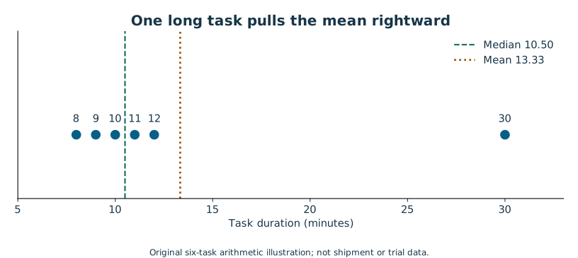
Consider six fictional task durations in minutes: 8, 9, 10, 11, 12 and 30. We use this deliberately small list so you can check every calculation without writing code. It is a separate arithmetic example, not a subset of the shipment file.
Two honest centers, two different questions
Add the durations: 8 + 9 + 10 + 11 + 12 + 30 = 80. Divide by six to obtain a mean of 13.333… minutes. If all six jobs had taken that long, their total would still be 80 minutes. The mean is a balance point for the total, so the 30-minute job pulls it upward.
For the median, sort the observations first. There are six values, so the middle lies between the third and fourth: (10 + 11) / 2 = 10.5 minutes. The median describes a middle position, not a share of the total. Five of these six jobs are shorter than the mean, which is possible because the mean is not defined as the halfway-ranked value.
If the longest job changes from 30 to 60, the mean rises to 18.333… minutes while the median remains 10.5. That does not prove the median is always “better.” A planner paying for all the minutes needs to account for the long job. A user asking about a typical wait should also hear about the tail. A useful sentence is “The median was 10.5 minutes; the mean was 13.3 because one of six jobs took 30 minutes.”
Spread makes the center useful
The range is 30 − 8 = 22 minutes. It shows the endpoints but ignores the other four values. The interquartile range, or IQR, focuses on the middle of the ranked data. We use NumPy's linear interpolation convention throughout, because software packages can disagree on quartiles for small samples.
For six sorted values, the zero-based position of the 25th percentile is (6 − 1) × 0.25 = 1.25. Position 1 is 9 and position 2 is 10. Move one quarter of the way from 9 to 10: Q1 is 9.25. The 75th-percentile position is 3.75, between 11 and 12, giving Q3 = 11.75. The IQR is 11.75 − 9.25 = 2.5 minutes. A different documented convention can give a different correct answer; silently mixing conventions cannot.
Standard deviation uses all the values. First find how far each observation is from the mean. Square those deviations so positives and negatives do not cancel. Their sum here is 343.333… squared minutes. For the sample variance, divide by n − 1 = 5, obtaining 68.666… squared minutes. Take the square root to return to minutes: the sample standard deviation is 8.287 minutes. You do not need to memorize the squared deviations; understand that far-away points receive substantial weight.
We use the sample standard deviation, denoted s, in the inferential examples because the observed sample is being used to estimate a process's variation. Dividing by n instead describes the variance of those particular listed values as a complete finite population. State which convention you used. Standard deviation describes variation among individual observations. It is not the uncertainty of the sample mean; that distinction arrives in Lesson 6.
An outlier flag is a question
A common boxplot fence puts a flag above Q3 + 1.5 × IQR. Here the upper fence is 11.75 + 3.75 = 15.5 minutes. The 30-minute job is flagged. The rule does not establish that it is a mistake, a statistically impossible event, or a record you are allowed to delete.
Ask what happened. Perhaps a timestamp was entered incorrectly. Perhaps the job was genuinely difficult. If an independently verified correction exists, record the correction and its provenance. If the value is plausible and unverified, retain it in the primary result. You can report a sensitivity comparison with and without it, clearly labelled, to show how much it influences the conclusion. Removing it would reduce this example's mean to 10 minutes. Reporting only that smaller number would misrepresent the original six jobs.
A long right tail means some large values stretch the distribution. It is not a diagnosis. Mixed task types can create that tail, and a logarithmic scale or a more robust summary may help exploration. Neither transformation nor trimming should be chosen after seeing which version makes a preferred story look strongest.
Apply the reasoning to the shipment file
For actual delivery time, report the count, mean, median, sample SD, IQR and range together during exploration. Do not call a delivery “bad” solely because it is far from the average: distance and promise matter. For ratings, report the ordered category counts and missing count before choosing a mean. These summaries let another person see what a single headline number conceals.
Attempt Practice 2A–2C. Explain why deleting the 30-minute value is a substantive decision, and why an average rating of 4 does not imply most people selected 4.
Further reading: NIST on location, NIST on spread, NumPy's quantile methods, and NIST on investigating outliers.
3 Make a chart that answers a specific question
Before choosing a chart, finish this sentence: “I want the reader to compare…” The answer determines what marks belong on the page. Comparing hub late rates is different from examining the spread of delivery times or tracking a weekly pattern. A colorful chart chosen before the question can make the wrong comparison feel persuasive.
The Python course taught how to create and label a chart. This lesson concentrates on statistical meaning. You can work on paper or in a spreadsheet; charting code is an optional companion. The supplied SVGs have written descriptions, and every statistical conclusion must be understandable without distinguishing colors.
Counts, distributions and time
For categories such as service type, a bar chart gives each category its own separated bar. Its length encodes a count or percentage. If you use bar length, start the numerical axis at zero. A bar representing 52% should be only slightly longer than one representing 50%, not twice as long because the axis begins at 48%.
For a numerical distribution, a histogram groups nearby values into bins. The bars touch because each bin covers a numerical interval. With equal-width bins, the bar height can show the number of observations in that interval. A bin from 20 up to but not including 30 minutes contains 20.0 and 29.9 but not 30.0. Specify the last-bin boundary if it includes the maximum. Different bin widths can reveal or obscure a pattern, so inspect more than one reasonable width during exploration rather than choosing the most dramatic view.
A histogram loses the exact positions inside a bin. For the six-value example in Lesson 2, a dot plot is more transparent: all six observations fit comfortably. For 240 shipments, a histogram is a compact overview. A boxplot can compare center and spread across groups, but a box is not a confidence interval. In our convention, its box spans Q1 to Q3, its center line is the median, and whiskers reach observed values inside 1.5-IQR fences. Dots beyond the whiskers are flagged observations, not automatically errors.
For a pattern over weeks, use a line chart with time in order. Do not sort weeks by their outcome and then connect them. The line would imply a progression that never happened. Display the denominator for each rate or give it in a nearby table. A change from 1/5 to 2/5 is a 20-percentage-point increase but only one additional event, which affects how strongly you should interpret it.
Read a distribution before summarizing it
Open the shipment-duration histogram. Read the horizontal axis first: actual delivery time in minutes. Read the vertical axis: shipment count. Then look for center, spread, tail, gaps and more than one cluster. A long right tail could reflect long routes or unusual delays. A second cluster could reflect mixed services. The chart supplies questions to investigate; it does not identify a cause.
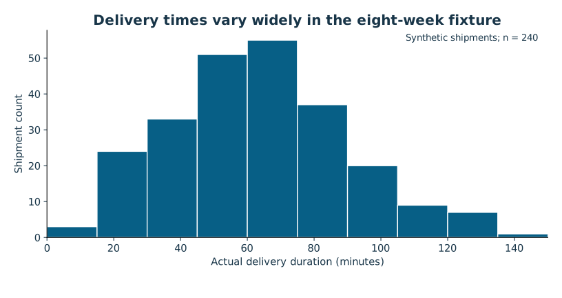
Next compare groups on a common scale. If East and West each get a panel, use the same axis limits when comparing their distributions. A tall narrow chart and a short wide chart can make the same spread appear different. If you use percentages because group sizes differ, label them as percentages and disclose the group counts.
A worked chart repair
Imagine a slide titled “West wins” with two unlabeled bars, East at 18 and West at 12. Are these minutes, late shipments or percentages? Which weeks? Are the values counts from equal-sized groups? The viewer cannot tell. Suppose the underlying invented counts were 18 late out of 120 East shipments and 12 late out of 120 West shipments. An honest descriptive repair labels them 15% (18/120) and 10% (12/120), uses a zero baseline, and titles the chart “Recorded late rate was 5 percentage points lower at West.”
A footnote then says that route and service mix may differ, so the chart does not measure a causal hub effect. Those numbers are a separate illustration, not the supplied fixture results. Notice that the repaired title still communicates a finding. Honesty does not require making the reader guess what matters.
The chart and the table support each other
A chart makes patterns easier to see. A nearby table makes exact values inspectable and helps readers who cannot use the image. A useful description names the pattern, units, population and important exceptions; “bar chart” is not enough. Avoid relying on red versus green alone. Use direct labels, shapes or line styles, sufficient contrast, and readable text.
A deliberately limited y-axis can be appropriate in a line or dot plot when small differences matter, provided the limits and values are prominent. It becomes misleading when visual area or bar length suggests a much larger ratio. The underlying rule is to preserve the comparison the marks invite the viewer to make. For uncertainty intervals, label whether they represent SD, SE, confidence intervals or prediction intervals; these answer different questions.
Attempt Practice 3A–3C. State what your chosen chart lets a reader compare, then identify one plausible misunderstanding and design it out. Later, you will adapt the same evidence for different audiences without changing the evidence itself.
Further reading: NIST's histogram guide and boxplot definitions.
4 Ask who and what are missing
A table can have perfectly valid numbers and still give a misleading answer. Imagine measuring delivery satisfaction only among people who voluntarily complete a survey. Even if every recorded answer is accurate, respondents may differ from nonrespondents. The problem is selection, not arithmetic.
The shipment file is a complete set of 240 generated records in its fictional eight-week window. Its observed late fraction exactly describes those records after the documented cleaning. It is not automatically an estimate of every future shipment, another season, another city or a real company. To generalize, you need a relationship between the observed data and the target population, plus assumptions about how the process changes.
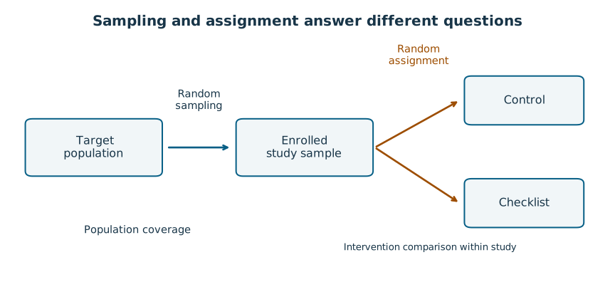
Random sampling and random assignment solve different problems
Random sampling selects units from a population. If the selection design gives the population suitable coverage, it can support generalization to that population. Random assignment allocates an intervention among enrolled units. It helps separate the intervention's effect from pre-existing differences, in expectation, within the experimental setting. A randomized trial made up of convenient volunteers is still a convenience sample of people.
The separate checklist fixture randomizes 40 simulated participants into 20 control and 20 checklist assignments. Each simulated participant contributes one independent outcome. It illustrates an experiment; it does not demonstrate that an actual checklist works for real workers. Conversely, the shipment file contains no randomized hub assignment. A large difference between hubs could reflect routes and service mix rather than hub management.
Larger is not a cure for biased selection
Suppose an operation handles 900 short jobs and 100 long jobs. Short jobs average 10 minutes and long jobs average 40. The population mean is (900 × 10 + 100 × 40) / 1,000 = 13 minutes. A convenience sample containing 50 of each type has mean (50 × 10 + 50 × 40) / 100 = 25 minutes. Taking 500 of each type would still target an equal mixture and would still have mean 25 under these values. More observations sharpen the wrong comparison if the selection pattern remains wrong.
Weighting could recover 13 here because the true group shares and group means were supplied: 0.9 × 10 + 0.1 × 40. In actual work, weights require a justified sampling or adjustment model. They cannot fix missing groups whose outcomes you never observe without additional assumptions. Do not assign weights merely until the result matches what you expected.
Missing does not mean zero
In the shipment generator, a rating is more likely to be missing when the shipment is late. You can see that mechanism in the documented source because this is a teaching simulation. In a real dataset, the missingness mechanism is usually not fully observable. You can measure different response rates by known groups, but you cannot learn every missing person's opinion from those rates.
Report the response count and denominator alongside a rating summary. Check response rates separately for late and on-time shipments. If late shipments respond less often and tend to receive lower ratings among respondents, the overall respondent average may overstate satisfaction across all shipments. The observed data alone cannot identify the exact size of that bias.
A small bounds example shows the issue. Suppose six of ten people respond with ratings 4, 4, 5, 3, 4, 4. The observed sum is 24 and the respondent mean is 4.0. If the four missing ratings were all 1, the all-person mean would be (24 + 4) / 10 = 2.8. If they were all 5, it would be (24 + 20) / 10 = 4.4. These are worst-case bounds given the 1–5 scale, not a confidence interval and not predictions of what missing people would say. They make the information gap visible.
Independence is about how observations arise
Forty independent participants are not interchangeable with forty observations from four participants. Repeated readings from the same person may move together. Likewise, shipments in the same week may share conditions. Counting correlated records as independent can make a standard error too small and an interval too narrow.
Our shipment generator includes shared weekly conditions. We therefore use its rates and comparisons descriptively in the required work. We do not attach a naive independent-shipment t-test to every comparison. Analyses of clustered, time-series or repeated-measures data need additional methods beyond this course. “The software returned a p-value” does not establish that the independence assumption held.
What a limitations statement should do
A useful limitation identifies how the conclusion could change: “Ratings were missing more often for late shipments, so the respondent average may not represent all shipments.” “The sample is small” is less useful unless you explain that the interval is wide or a group is poorly represented. State selection, measurement, missingness and dependence concerns before the recommendation depends on ignoring them.
Attempt Practice 4A–4C and then Checkpoint A. You should be able to name the target population, describe how units reached the file, and distinguish an unobserved value from an observed zero.
Further reading: NIST on randomized designs and the assumptions behind common analyses.
5 Reason about probability without losing the denominator
Probability gives us a language for uncertainty. Probabilities range from 0 to 1. In our finite counting examples, 0 means no favorable cases and 1 means all cases are favorable. Continuous models need more care: an exact value can have probability zero without being impossible. Between the endpoints, the value describes how much chance the model assigns to an event. An observed proportion is a count divided by a count. It can inform a probability model, but it is not a guarantee about the next case.
In the supplied shipment file, 51 of 240 shipments are late. The observed fraction is 51/240 = 0.2125, or 21.25%. If you selected one of these 240 rows uniformly at random, the probability it is a late row would be exactly 21.25%. If you asked whether tomorrow's first real delivery would be late, this fictional file would provide no real-world evidence. Even in a genuine operation, that prediction would require assumptions about how tomorrow resembles the recorded period.
Complement and conditional probability
If late and on-time are exhaustive categories with no unknown status, the on-time probability is 1 minus the late probability. In a separate model with late probability 0.20, the on-time probability is 0.80. If unknown statuses exist, “not known to be late” is not the same as “known to be on time.” Define the categories before subtracting.
Conditional probability means restricting attention to a condition. Suppose a tiny invented table has 100 deliveries: 20 priority, of which 4 are late, and 80 standard, of which 24 are late. The late rate among priority deliveries is 4/20 = 20%. The priority share among late deliveries is 4/28 ≈ 14.29%. Both are valid, but the denominators answer different questions. Read “among” as an instruction to define the denominator.
The joint probability of being both priority and late in this table is 4/100 = 4%. It also equals the priority share, 20/100, multiplied by the late fraction within priority, 4/20. The middle count cancels: (20/100) × (4/20) = 4/100. This multiplication uses a conditional probability, so it does not assume independence.
Independence is a claim, not a default
Two events are independent when learning that one occurred does not change the probability of the other under the model. Only then can you multiply their separate probabilities directly. If two independent shipments each have a 0.20 chance of being late, the chance both are late is 0.20 × 0.20 = 0.04. The chance at least one is late is easier through the complement: 1 − 0.80 × 0.80 = 0.36.
Shared road closures or weather could make real shipment outcomes dependent. The independence calculation would then be inappropriate. Our observational fixture includes shared weekly conditions, so the two-shipment calculation is explicitly a separate toy model. Never carry an assumption from an easy example into a new dataset without checking the design.
A base-rate example you can count
Imagine a fictional alert system evaluated on 1,000 jobs. Exactly 100 are truly delayed. It flags 80 of those 100, and it also flags 90 of the 900 jobs that are not delayed. The system catches 80% of delayed jobs, but a flagged job is not delayed with 80% probability.
| Actual state | Flagged | Not flagged | Total |
|---|---|---|---|
| Delayed | 80 | 20 | 100 |
| Not delayed | 90 | 810 | 900 |
| Total | 170 | 830 | 1,000 |
Among all 170 flags, only 80 represent delayed jobs: 80/170 ≈ 47.06%. The many non-delayed jobs create 90 false alarms even though only 10% of that group is flagged. The underlying prevalence, 100/1,000, is called a base rate. Ignoring it can turn a technically correct performance statement into an incorrect operational expectation.
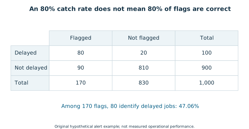
A manager deciding whether to investigate each flag needs the expected workload and false-alarm burden, not just the catch rate. If investigation costs 2 minutes per flag, these 170 flags require 340 minutes in this example. That is arithmetic under an explicitly supplied cost assumption, not a cost estimate for the shipment operation.
From individual outcomes to distributions
A binary late outcome has two possible values, 0 and 1. A count of late outcomes across independent trials with the same late probability follows a binomial model. Actual delivery minutes vary on a numerical scale and usually require a different model. Not every measurement is bell-shaped, and the fact that software offers a normal distribution is not evidence that your data follows it.
You now have enough probability vocabulary for sampling uncertainty: an event, a probability under a model, a condition, independence and a distribution of possible outcomes. Attempt Practice 5A–5C. The most important habit is to write the denominator in words before calculating a percentage.
Further reading: NIST's binomial model. The alert example is an original, fully specified counting exercise.
6 Separate variation in people from uncertainty in an average
Imagine repeating a study tomorrow with new participants from the same stable process. The observed mean will usually change. That is sampling variability. It is possible for individual outcomes to remain highly variable while the average across many independent outcomes becomes fairly stable.
This distinction is central to inference. A standard deviation describes how individual outcomes vary. A standard error describes how an estimate would vary across repeated samples under a sampling model. Neither word means “the spreadsheet contains a mistake.”
A complete miniature sampling experiment
Take a tiny fictional population with values 2, 4 and 6 minutes. Its mean is 4. Draw two values independently, with replacement, so drawing a 2 first does not remove it before the second draw. There are nine equally likely ordered samples:
| Draws | Mean | Draws | Mean | Draws | Mean |
|---|---|---|---|---|---|
| 2, 2 | 2 | 2, 4 | 3 | 2, 6 | 4 |
| 4, 2 | 3 | 4, 4 | 4 | 4, 6 | 5 |
| 6, 2 | 4 | 6, 4 | 5 | 6, 6 | 6 |
The sampling distribution of the mean is therefore 2 once, 3 twice, 4 three times, 5 twice and 6 once. Its average is also 4. The possible sample means cluster more closely around 4 than individual values do. We have not improved any person's duration; we have made an average less variable by combining independent information.
This example lists all possible samples, so no simulation is necessary. In a real process we rarely know the population well enough to enumerate them. We estimate the variability from the sample and use a model to describe what repeated samples might do.
Work a standard error
For an independent sample from a process with finite variance, an estimated standard error of the mean is the sample SD divided by the square root of the sample size. Suppose the observed SD is 4 minutes and n = 16. The square root of 16 is 4, so SE = 4/4 = 1 minute. An individual participant can still differ from the mean by several minutes even though the average is estimated more precisely.
If n increases to 64 and SD stays around 4, the SE becomes 4/8 = 0.5 minutes. Four times as many independent observations halve the standard error in this simplified comparison. Doubling the sample size does not halve it. This square-root relationship also does not remove selection bias, missingness bias or a poor measurement definition.
In the simulated trial, the control group has n = 20, mean 23.9895 minutes and SD about 4.1254. Its standard error is about 4.1254/√20 = 0.9225 minutes. The SD describes the spread of simulated participant durations; the SE describes uncertainty in the estimated process mean under the study model. Displaying an SE error bar as if it represented most individual participants would conceal much of the participant-to-participant variation.
What the central limit idea does and does not promise
Under suitable conditions, averages of many independent observations have an approximately normal sampling distribution, even when the individual observations are not normal. This is a statement about the distribution of averages across repeated samples. It does not turn the original histogram into a bell curve.
There is no universal threshold at which “n ≥ 30” makes every problem safe. Heavy tails, extreme outliers, dependence and strong skew can make approximations poor. A small sample from a reasonably normal process can be suitable for a t-method; a large collection of strongly dependent records can still be unsuitable for an ordinary independent-observation method.
The trial generator supplies independent normal outcome noise by design, with one observation per simulated participant. The shipment generator deliberately supplies a more complicated process with shared weekly conditions. We use the trial for introductory inference and the shipments for descriptive comparisons. This is method selection based on how the data arose, rather than choosing a method because it produces an interesting answer.
A simulation is a demonstration of assumptions
The optional companion produces repeated 20-observation samples from a stated normal model and computes their means. The changing sample means illustrate variability; they do not validate a model for a real operation. A random seed makes a demonstration repeatable. It does not make one particular simulated result more truthful, and changing the seed until a desired result appears would hide the selection process.
When reporting precision, name the estimator, model, unit and number of independent units. “SE = 0.92” without “minutes, for the control mean, n = 20” is incomplete. When two datasets contain the same number of rows, ask whether they contain the same amount of independent information.
Attempt Practice 6A–6C. Explain why reducing SE is not the same as reducing individual delivery variability, then use the miniature sampling table to distinguish a population distribution from a sampling distribution.
Further reading: NIST's confidence-interval setup and normal distribution reference.
7 Put a range around an estimate
A point estimate is useful, but it does not tell the reader how precisely the underlying quantity is estimated. A confidence interval adds a range produced by a stated method. It should travel with the point estimate and the design assumptions, rather than appear as a decorative pair of brackets.
We begin with the mean duration in the control arm of the simulated checklist trial. The target is the mean for repeated independent tasks generated under this teaching model, not the duration of the next individual task and not a real workforce average.
Build one interval step by step
The 20 control outcomes have mean 23.9895 minutes and sample SD 4.1254 minutes. We estimate the standard error by dividing SD by √20, obtaining about 0.9225 minutes. A two-sided 95% Student-t interval uses a multiplier from a t distribution with n − 1 = 19 degrees of freedom. That multiplier is about 2.093. You can use the supplied result without deriving the t distribution.
Multiply the standard error by the multiplier: 2.093 × 0.9225 ≈ 1.9307 minutes. This is the margin of error under the method. Subtract and add it to the mean: 23.9895 − 1.9307 ≈ 22.06 and 23.9895 + 1.9307 ≈ 25.92 minutes. The exact calculation appears in the reference output; the lesson rounds intermediate values for readability.
The logic is estimate, plus or minus a method-based allowance for sampling variability. Greater individual variation widens the allowance. More independent observations generally narrow it. A higher confidence level, such as 99%, uses a larger multiplier and yields a wider interval for the same data.
The t method is exact for independent, identically distributed normal observations when the variance is unknown. It can be a useful approximation under some departures, but an interval computed without considering skew, outliers and dependence has not earned its interpretation. The simulated trial was constructed for this introductory model. A real study would require substantive checks of design and diagnostics; a passed normality test alone would not establish independence.
Interpret what is random
Before collecting a sample, the interval you will calculate is random because the data will vary. The underlying process mean is treated as fixed in this frequentist method. If we repeatedly sampled in the same way and computed 95% intervals, the procedure would cover that fixed mean in about 95% of repetitions when its assumptions hold. For the interval already observed, the fixed mean is either inside or outside.
Do not translate 95% into “95% of individual tasks took between 22.06 and 25.92 minutes.” The interval concerns the mean. Individual durations have much wider variation. Do not say the data give a 95% probability that the fixed mean lies inside this particular interval under the frequentist procedure. A Bayesian probability interval requires an explicit prior and model, which this course does not teach.
A practical wording is: “The estimated control mean was 23.99 minutes; a 95% t-confidence interval was approximately 22.06 to 25.92 minutes under the independent normal-process model.” This is concise without pretending the interval covers every source of uncertainty.
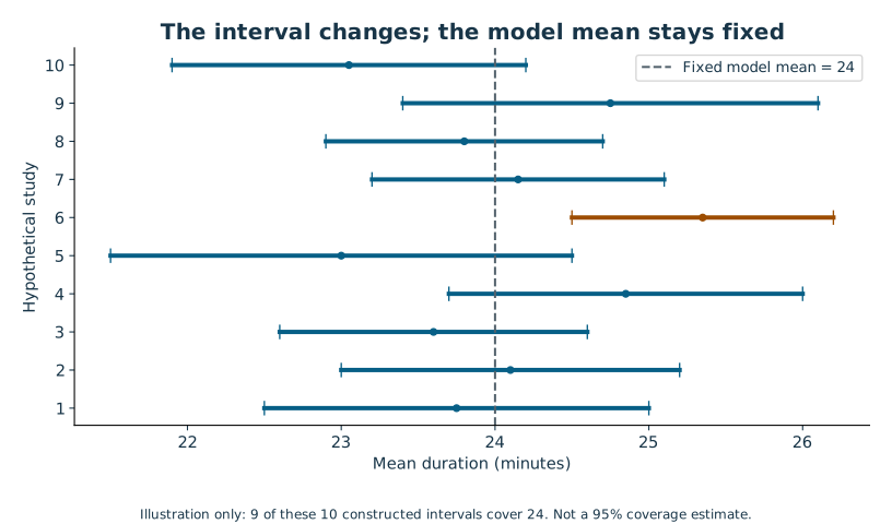
What is outside the interval's protection
The margin of error does not automatically include biased recruitment, instrument error, missing outcomes, changing operations or a wrong model. A narrow interval from the wrong population can be confidently irrelevant. In the shipment file, a naive interval treating all 240 records as independent would ignore the shared weekly conditions. The required course avoids that calculation rather than teaching a falsely precise number.
An interval for a mean is also not a prediction interval for a future observation. A future task brings its own individual noise in addition to uncertainty about the mean, so its predictive range is usually wider under the same model. If the manager asks for a promise that covers most future deliveries, a mean-confidence interval is answering the wrong question.
Compare to a meaningful target cautiously
Suppose a fictional planning target is a mean below 23 minutes. The control interval spans 23. These data do not clearly distinguish a process mean just below that target from one above it under this method. It would be incorrect to conclude “the target is met” merely because part of the interval is below 23. A target is a decision criterion, and an interval describes estimation uncertainty; neither eliminates the other.
Next we will estimate a difference between two groups. Comparing two separate mean intervals by eye is not the same as computing the interval for their difference. Use a method that directly matches the question.
Attempt Practice 7A–7C. Rewrite one tempting misinterpretation and explain what additional information would be needed to estimate a future individual's duration.
Further reading: NIST's confidence limits for the mean and SciPy's t distribution.
8 Compare groups without turning a p-value into a verdict
The checklist question concerns a difference: does the average task duration change when the checklist is used? Define the contrast before calculating. We use checklist minus control, so a negative difference means the checklist group was faster. Keeping that sign convention throughout prevents an otherwise correct calculation from being narrated backward.
The fixture contains 40 simulated participants, randomly assigned to two groups of 20. Each contributes one task duration. The generator specifies independent normal noise and a constant 3-minute checklist reduction; random assignment and sample noise mean the observed difference need not equal exactly −3. No observations were rerolled to get a preferred p-value. Because the whole study is simulated, it teaches analysis rather than validating a real checklist.
Estimate the difference first
The control mean is 23.9895 minutes with SD 4.1254. The checklist mean is 20.7880 with SD 4.1477. Subtract: 20.7880 − 23.9895 = −3.2015 minutes. The observed checklist mean is about 3.20 minutes lower. Relative to the control mean, −3.2015/23.9895 × 100 ≈ −13.35%. The absolute difference is often easier to connect to a decision than the percentage alone.
We use Welch's independent-samples t method. It does not require equal population variances. Its standard error for the difference combines the two groups' squared standard errors: square each SD, divide by its group size, add, and take the square root. Here that gives about 1.3081 minutes. Software calculates a Welch degrees-of-freedom value of about 38 and uses the corresponding t multiplier.
The compatible two-sided 95% confidence interval for checklist minus control is −5.85 to −0.55 minutes. In reduction language, the interval corresponds to approximately 0.55 to 5.85 minutes faster under the stated model. It excludes zero but spans a wide range of practical benefits. The interval is about a mean effect in the model, not a guarantee that every participant benefits.
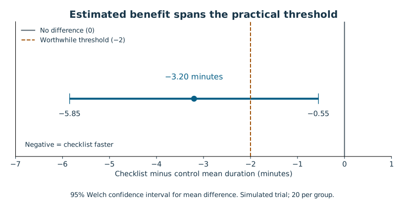
What the test asks
The null hypothesis is that the two model population means are equal, or that checklist minus control equals zero. The two-sided alternative allows a difference in either direction. “Two-sided” is chosen before inspecting the outcome; it is not selected afterward because one direction looks more favorable.
The test statistic is the estimated difference divided by its estimated standard error: approximately −3.2015/1.3081 = −2.4475. Under the null model and its assumptions, the two-sided p-value is the probability of obtaining a test statistic at least as extreme in magnitude as the one observed. Here p ≈ 0.0191. The p-value is not the probability that the null hypothesis is true, that the checklist works, or that the finding occurred “by chance.”
If a 0.05 threshold was specified in advance, the test rejects the zero-difference null at that level. That phrase is a procedural statement. It does not establish importance, eliminate model concerns, or make the experiment representative of a real setting. Report the estimate, interval, design and limitations with the p-value.
Errors and power in everyday terms
A Type I error means rejecting a true null under the decision rule. A test's nominal 5% level controls that error rate under its model across repeated uses, not the probability that this particular rejection is wrong. A Type II error means failing to reject a false null. Power is the probability of rejecting for a specified true effect, sample size, variation and test design.
“Not statistically significant” does not prove no difference or equivalence. A wide interval may include meaningful benefit and meaningful harm. Demonstrating equivalence requires a pre-specified acceptable range and a suitable equivalence procedure, beyond this course. Likewise, do not compute many alternative outcomes, subgroups and exclusion rules and then report only the smallest p-value. Multiple searching and repeated peeking can substantially increase false-positive risk.
In practice, write down the primary outcome, contrast, stopping rule, exclusion policy and minimum worthwhile effect before collecting data. If you explore additional questions, label them exploratory and consider a confirmatory follow-up. This separates useful discovery from claims that require stricter testing.
Match the method to the design
If the same participants performed before and after tasks, their two durations would be paired; you would analyze within-person differences using a suitable paired method. Our fixture uses independent participants, so pairing rows by CSV position would manufacture a relationship. If outcomes were binary, a mean-duration t-test would not be the right introductory method for comparing rates. If teams, rather than individuals, were randomized, team clustering would matter.
For optional Python, scipy.stats.ttest_ind(checklist, control, equal_var=False, alternative="two-sided") requests the method used here. The order of arrays determines the sign. The library's default assumes equal variances, so explicitly setting equal_var=False is important. The tests verify the reference using both formula calculations and SciPy.
Attempt Practice 8A–8C and Checkpoint B. You are ready when you can explain the p-value without treating it as a probability that a hypothesis is true, and when your recommendation survives without the word “significant.”
Further reading: NIST's two-sample methods, the pinned SciPy method, and the ASA's p-value guidance.
9 Decide whether a difference matters and whether the comparison is fair
A result can be statistically detectable and too small to matter. A result can also be practically important but estimated too imprecisely to establish with the current study. These are different problems, so report both effect size and uncertainty before making a recommendation.
The trial's estimated reduction is 3.20 minutes. Suppose a fictional manager says, before seeing results, that a reduction of at least 2 minutes would justify further operational work. That is a practical threshold supplied for this exercise, not a fact about an actual business. The confidence interval permits reductions from roughly 0.55 to 5.85 minutes. The estimate exceeds 2, but the interval includes benefits smaller than 2. Rejecting the zero-effect null does not establish that the effect clears the manager's threshold.
Use units that the decision needs
The absolute effect is −3.2015 minutes for checklist minus control. The relative effect is about −13.35% of the control mean. Both are legitimate if you state the reference. “A 13% improvement” without a denominator could refer to time, late rate, cost or something else.
For rates, distinguish percentage points from percent change. If a late rate falls from 20% to 15%, the absolute change is −5 percentage points. The relative change is (15 − 20)/20 = −25%. Saying “down 5%” would be ambiguous. A fall from 2% to 1% is only 1 percentage point but a 50% relative reduction. Include counts and baseline rates so the reader can judge the scale.
Standardized effect sizes express a difference relative to an outcome's variability. They can help compare studies using different scales, but they discard the original units that a manager often needs. We keep minutes as the primary effect size here. A universal label such as “large effect” should not substitute for actual costs, risks, implementation effort and outcome relevance.
A fair comparison needs a common question
In the recorded shipment file, East's mean actual time is 79.63 minutes and West's is 45.96, a raw difference of about 33.67 minutes. East also has longer routes on average: 36.85 km versus 18.67 km. Priority shipments account for 40/120 East records and 80/120 West records. A raw time comparison mixes these characteristics with hub labels.
Late rates tell a different descriptive story: East has 25/120 = 20.83%, while West has 26/120 = 21.67%. East is about 0.83 percentage points lower, although its mean absolute time is much longer. The two metrics answer different questions. Promise durations and service mix influence the late classification, so near-equal late rates do not establish that the hubs are equivalent either.
The documented generator has no direct hub term in actual delivery time; hub affects the mix of routes and service types. As authors, we know that because the data is invented. A real analyst would not have access to the true generating mechanism. The appropriate lesson is to inspect plausible confounders and avoid unsupported causal attribution, not to assume every observed hub difference must be caused only by the variables present in a CSV.
When aggregation reverses a comparison
Here is a separate, deliberately small example of on-time performance. It is not the 240-row dataset.
| Route type | Hub A on time | Hub B on time |
|---|---|---|
| Short | 81/90 = 90% | 19/20 = 95% |
| Long | 1/10 = 10% | 16/80 = 20% |
| Overall | 82/100 = 82% | 35/100 = 35% |
B has a higher on-time rate within both route types, yet A has a higher overall rate because A handled mostly easy short routes. The overall rate is a weighted average of group-specific rates. Each hub uses different weights. This pattern is often called Simpson's paradox; the arithmetic is ordinary weighted averaging.
If the decision concerns a population with equal short and long shares, a descriptive standardization gives A: 0.5 × 90% + 0.5 × 10% = 50%; B: 0.5 × 95% + 0.5 × 20% = 57.5%. The answer changes because the target mixture changes. Equal weighting is justified here only because the question explicitly specifies an equal mixture.
Stratifying or standardizing does not automatically create a causal estimate. Important confounders may remain unmeasured; some variables might be consequences of the intervention rather than appropriate adjustment variables; sparse subgroups may be unstable. Causal adjustment requires a substantive model and stronger assumptions than this beginner course provides.
Recommend an action proportional to the evidence
For the fictional checklist decision, a reasonable recommendation is to design a real, controlled field pilot that measures time, implementation burden and relevant quality outcomes. A full rollout justified solely by a p-value would overstate both practical certainty and transfer from simulation. For the hub question, investigate route/service mix and promise design before assigning blame.
Attempt Practice 9A–9C. Write the absolute effect, its reference, its interval and the practical threshold on four separate lines. If those four lines tell a more nuanced story than your headline, revise the headline.
Further reading: ASA guidance on effect size and significance. All hub examples and decision thresholds in this lesson are original fictional teaching scenarios.
10 Describe an association without inventing a cause
Longer routes tend to take longer in the shipment fixture. A scatterplot makes this relationship visible: each point represents one shipment, distance is on the horizontal axis, and actual minutes are on the vertical axis. It is important to keep the row pairing. Sorting distance and duration separately before correlating them would manufacture a relationship that the original records never contained.
The question now is descriptive: how do recorded distance and recorded time vary together? We are not estimating what would happen if a particular route were redesigned to be one kilometre shorter. That intervention could change traffic, service mix and other conditions beyond the single distance measurement.
Correlation compresses a pattern
Pearson's correlation, r, summarizes the direction and strength of a linear association. It ranges from −1 to 1 when both variables vary. A positive value means larger values of one variable tend to accompany larger values of the other in a roughly straight-line pattern. Changing kilometres to metres does not change r because the measure is unitless.
In this fixture, r is approximately 0.9226 for distance and actual time. That is a strong positive linear association in the observed data. It is not “92% of time caused by distance.” A correlation near zero would not rule out a curved relationship, and a high correlation can be influenced by unusual points or a mixture of distinct groups. Always examine the scatterplot alongside the number.
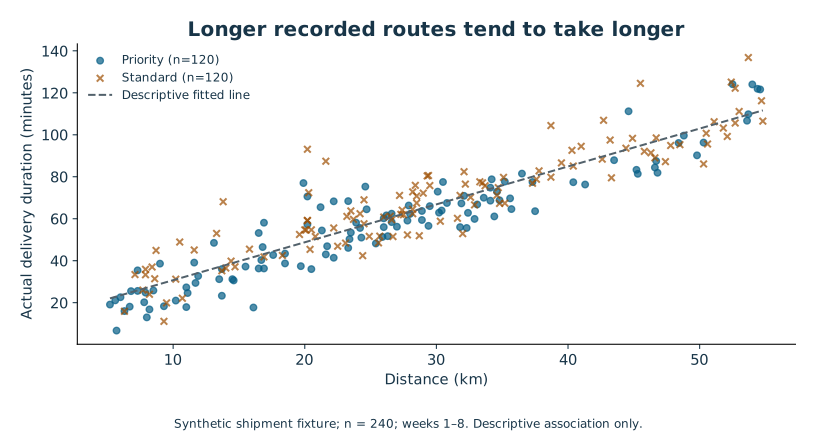
Translate a fitted line into a sentence
A simple least-squares regression fits a straight line by minimizing the sum of squared vertical residuals. A residual is observed outcome minus fitted outcome. For the shipment data, the fitted line is approximately:
Predicted actual minutes = 12.6622 + 1.8058 × distance in kilometres.
The slope says that, within this fitted descriptive model, a one-kilometre difference in distance corresponds to about 1.81 minutes higher fitted mean duration. It does not say that shortening any route by one kilometre would causally save exactly 1.81 minutes. Service mix, weekly conditions and omitted factors can shape the slope.
At 20 km, the fitted value is 12.6622 + 1.8058 × 20 ≈ 48.78 minutes. If a hypothetical observed 20-km delivery took 55 minutes, its residual would be 55 − 48.78 ≈ +6.22 minutes. A positive residual is above the fitted line. That hypothetical observation is for arithmetic practice; it is not an asserted record in the CSV.
The intercept, 12.66 minutes, is the line's fitted value at zero kilometres. The recorded distances run from 5.2 to 54.8 km. Zero lies outside that range, so the intercept need not have a useful operational meaning. Predicting at 100 km would be extrapolation beyond the observed support. A formula can return that number even when the data does not justify using it.
What R-squared says
For this simple least-squares fit with an intercept, R-squared is about 0.8513, equal to r squared. It describes the fraction of the observed outcome variation around its sample mean accounted for by the fitted line, in sample. It is not the fraction of outcomes predicted correctly, a causal fraction, or a guarantee of future performance.
A high R-squared can coexist with systematic mistakes. Perhaps the line is consistently too low for one service type, or the residuals grow with distance. A future-prediction task would also require evaluation on appropriate unseen data and attention to time or group leakage. The earlier Python and SQL courses prepare you to manage that data responsibly; training and evaluating predictive machine-learning models remain outside this course.
Inspect what the line misses
Plot residuals against fitted values and inspect groups and time. A curved pattern suggests the line misses structure. A fan shape suggests changing variability. A time pattern suggests changing conditions or dependence. Extreme residuals deserve investigation. A random-looking plot is useful evidence, but it cannot prove all assumptions.
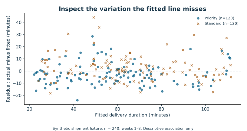
For conventional regression uncertainty, assumptions about the conditional mean, independent errors, error variance and distribution matter; their exact role depends on the inferential method. The shipment fixture includes shared weekly conditions and different service mixes, and a one-predictor line omits both. We therefore report its coefficients and R-squared descriptively and do not treat its default slope p-value or confidence interval as an endorsed inference.
Correlation is a starting point for a better question
A common cause can make two variables move together. Hot weather might raise both ice-cream sales and cooling costs; neither variable has to cause the other. Reverse causation and selection can also produce associations. Random assignment can support causal comparison under the study's assumptions, but a scatterplot alone cannot distinguish these explanations.
Attempt Practice 10A–10C. Explain the units of the slope, calculate a fitted value and residual, and write one sentence that clearly separates association from intervention. If your sentence contains “causes,” identify the design evidence that authorizes that word.
Further reading: NIST on scatterplots, NIST on model criticism and residuals, and SciPy's regression result definitions.
11 Turn evidence into a decision-ready story
Data storytelling is the work of helping a particular audience understand what the evidence means for a decision. It is not permission to remove inconvenient records, hide uncertainty or manufacture a dramatic ending. The story should become clearer as you shorten it, while its scope remains intact.
Begin with the reader. A manager needs to know what to do next and why. An analyst needs the definitions, methods and diagnostics needed to reproduce the result. A frontline team needs to know what change is proposed, what will be measured and what remains uncertain. You can change the order and detail for each audience without changing the underlying claim.
Separate observation, interpretation and recommendation
An observation is a checked description: “East's recorded mean duration was 79.63 minutes versus 45.96 at West.” An interpretation relates the result to context: “East also handled longer routes and a different service mix, so the raw gap does not isolate hub performance.” A recommendation proposes an action: “Investigate route and service mix before making a hub-performance decision.” These sentences play different roles.
When these roles blur, a number can acquire a causal story it did not earn. “East's poor management added 33.67 minutes” skips from an observed difference to an unmeasured explanation. An honest story can still be specific: name the missing comparison that would make a decision safer, and say what evidence would change your recommendation.
Build a short evidence chain
Use this sequence when preparing a decision brief:
- State the decision and the proposed next step.
- Give one or two checked findings with units, denominators and period.
- Explain the comparison and the uncertainty that matters to the decision.
- State the boundary of the conclusion.
- Identify a concrete next measurement or decision trigger.
This is a writing scaffold, not a requirement that every report use the same five headings. The reason for the sequence is to keep the recommendation traceable to evidence. A reader should be able to ask “Why?” and move backward from action to finding to raw data and definitions.
A worked management brief
“Plan a real controlled pilot before considering a full checklist rollout. In the simulated 40-participant teaching trial, the checklist mean was 3.20 minutes lower than control; the 95% Welch interval was 0.55 to 5.85 minutes lower. The interval includes benefits smaller than the hypothetical 2-minute worthwhile threshold. These synthetic results do not establish real-world effectiveness or capture cost and quality trade-offs. A real pilot should pre-specify the primary outcome, independent assignment unit, sample-size plan and quality guardrails.”
Notice what the brief does not do. It does not put p = 0.0191 in the headline, because the decision depends more directly on the effect range and threshold. The p-value can appear in the methods appendix. It does not promise that collecting more data will confirm the favored outcome. It describes what the next study must resolve.
For the observational side, a companion paragraph might say: “Across the 240 recorded synthetic shipments in weeks 1–8, 51 were late (21.25%). East and West had 25/120 and 26/120 late shipments respectively, while route lengths and service shares differed substantially. Investigate comparable route/service groups and promise definitions before interpreting a raw hub ranking.”
Choose the visual for the sentence
If your key sentence is about the checklist effect and a worthwhile threshold, show the difference interval with a zero line and a −2-minute reference. Two separate mean bars hide the direct contrast and can make overlap confusing. Label the direction: negative means lower checklist duration.
If your sentence concerns the shape of delivery times, use the histogram or a dot/box display rather than the effect-interval chart. If it concerns rating response bias, show response counts or rates for late and on-time shipments, with denominators. Every figure needs a caption that can stand alone outside the slide deck: outcome, units, source file, scope and meaning of uncertainty marks.
Include a text equivalent. For the trial chart: “The point estimate is −3.20 minutes; the interval spans −5.85 to −0.55, excluding zero but crossing the −2-minute worthwhile threshold.” A person who cannot see the graph now receives the same essential comparison. Do not use color alone to distinguish observed results from thresholds.
Be concise without burying limitations
Not all caveats deserve equal prominence. Put the limitation that could change the decision beside the headline. Put technical implementation details in a reproducibility appendix. “Synthetic data; operational effectiveness untested” belongs near a rollout recommendation. The exact random seed belongs in the appendix. Both matter, but they serve different reading needs.
A practical audit asks: could someone copy the chart into another presentation and unintentionally make a stronger claim? If so, add a scope label to the chart itself. Does the title say “proves” when the design only supports association? Are counts missing? Is the selected period unusually favorable? Have you disclosed excluded records and exploratory comparisons? Does a polished number imply precision beyond the data, such as reporting a rough operational estimate to six decimals?
Make the next step falsifiable
“Continue monitoring” is often too vague. A better proposal names what would be measured and what would count as a decision change. For this capstone, propose a real pilot design and a pre-specified practical threshold; do not invent an exact required sample size without a power calculation and justified inputs. Specify a quality outcome that the current fixture lacks and explain why it matters.
Attempt Practice 11A–11C and Checkpoint C. Your goal is a brief that another person can challenge constructively because the question, evidence and uncertainties are visible.
12 Deliver an analysis another person can inspect
The capstone brings the course together. You are an analyst advising the fictional Northstar Dispatch manager. The manager wants to choose the next operational investigation and decide whether the checklist deserves a real field pilot. The supplied shipments and simulated trial are the only quantitative evidence available. You must use their strengths without pretending they contain evidence they do not have.
A successful submission is not a gallery of every statistical technique in the course. It is a coherent answer to a bounded decision, with enough supporting detail for another learner to check it. You can complete the required work with a calculator, a spreadsheet and the supplied data. Python is an optional reproducibility route, not a hidden entrance requirement.
Stage 1 Define the question before opening the answer key
Write the population, unit, period and outcome for each part of the task. Identify what “late” means and which file supports description versus simulated experimental inference. Record the fictional manager's threshold of a 2-minute mean reduction for a potentially worthwhile checklist improvement. Treat that threshold as supplied before the analysis, not as a line you can move after seeing results.
Choose one additional question to explore within the shipment data, such as whether late rates differ by service or whether rating response varies with late status. Label it exploratory and define the denominator. A good question can reveal a limitation rather than produce a new recommendation.
Save this short plan before calculating. In real work, a written plan helps distinguish expected analyses from opportunistic searches. Here, it gives you a record you can compare with the final report. If the plan changes for a legitimate reason, retain the original and explain the revision.
Stage 2 Reconcile and summarize
Preserve the raw export. Apply or inspect the documented validation policy and reconcile its 248 records to 240 accepted shipments, three duplicates and five invalid extras. Show that normalized formatting and recomputed late flags do not create extra shipments. Include the missing-rating count separately because a missing optional rating does not invalidate a shipment's timing record.
Calculate the overall late rate and hub counts, then compare actual-time summaries with route and service mix. Use at least one distribution summary beyond the mean. State the quartile convention if you report an IQR. Investigate a surprising value instead of deleting it solely because it is inconvenient.
For a calculator or spreadsheet route, show formulas and a small row-level spot-check. For Python, write or adapt your own analysis in the learner starter and record how to run it. Running the reference program verifies the package, not your understanding.
Stage 3 Make the statistical argument
Calculate the checklist-minus-control difference, its compatible 95% Welch interval and the two-sided p-value. The supplied method output may be used if you cannot compute the distribution functions by hand, but you must show the group summaries, effect direction and interpretation. Explain the independence and model assumptions and why the trial is different from the observational shipment file.
Compare the interval with both zero and the −2-minute threshold. State what has and has not been established. Do not convert the simulated result into a claim about real workers. Do not use a non-significant hub comparison to announce equality. A decision memo can honestly say that the current evidence is insufficient for a stronger commitment.
Stage 4 Design for a reader
Prepare two charts that answer different questions. At least one must show the trial effect and its uncertainty, rather than just the two group means. The other should support the operational investigation you recommend. Give each a readable title, labels, units, population, count and accessible text description. Put exact plotted values in a nearby table or appendix.
Write a 250–400-word management brief. It should lead with the recommendation, then provide evidence and the limitation most likely to change that recommendation. Add a short methods appendix with data policy, calculations, assumptions and reproducibility details. A headline that cannot survive the appendix needs revision.
Stage 5 Ask a skeptical reviewer to reproduce it
Use the rubric in the capstone brief. A peer should be able to trace every headline number to a definition and source file. Ask the peer to find your most consequential assumption and propose a plausible condition under which your recommendation would change. Fix the substance before polishing typography.
The public learner checker, when used, checks selected arithmetic and labels in your own result JSON. It cannot judge whether your story is honest or whether a chart is accessible. The reference test suite checks the supplied implementation. Neither is an automatic course grade. The rubric includes reasoning and communication precisely because a technically correct number can support a misleading claim.
After reviewing a worked solution, close it and explain your own conclusion aloud without looking. Then answer a transfer question: if the same 40 outcomes came from four people measured ten times each, what would have to change? If your answer is “nothing, the row count is still 40,” return to independence and study design before submitting.
Attempt Practice 12A–12C, complete the staged capstone and use the self-review checklist. The suggested study times are provisional design estimates; no beginner pilot has established that this pacing works for every learner.
Validation and release limits
Executed checks
The companion was executed in a Linux workspace using Python 3.12.14, NumPy 2.3.5, SciPy 1.17.0 and Matplotlib 3.10.8. Editorial HTML uses Markdown 3.11.1. Exact versions describe this environment; they do not guarantee installation on every operating system or future package index.
The suite has 76 passing tests (66 data/method checks and 10 public-checker checks) covering fixture construction, raw cleaning, count reconciliation, conflicting duplicates, summaries, linear quartiles, missingness, independent calculations against SciPy, mean intervals, Welch contrast/CI/test, regression and sampling demonstrations. Data and numerical outputs were regenerated from another working directory and compared byte-for-byte; checksums and scope are recorded in outputs/data_reproducibility.json.
An independent reviewer recomputed the published values directly from CSV using decimal arithmetic/manual interpolation and SciPy without importing the reference analysis or generator. The check covered 690 numerical comparisons, including raw reconciliation, summary values, missingness, effect direction, interval/test compatibility and regression. Teaching-sequence and audit issues found in review were corrected. The complete narrative, workbook, explained solutions, assessments and capstone were also reviewed independently. Review identified a conflicting-duplicate audit edge case, an exercise using inference before it was taught, a filename error and an overly broad probability-zero statement; all were corrected. Visual review also prompted moving an overlapping legend and making chart scope visible.
Static package checks cover 279 checks across three HTML pages, 96 local references, nine SVGs and all exercise/answer identifiers. The optional unfinished learner starter was executed and failed as intended; an independently calculated completed payload passed the 12 public arithmetic/label checks, while a reversed effect failed. The checker does not assess the quality of a limitations statement or recommendation.
Nine original SVG visuals have explicit titles/descriptions and text alternatives in the reading pages. Their matching PNG renders were visually inspected for readable labels, clipping and scale/legend consistency. This is chart-artifact inspection, not a browser or screen-reader test.
What is not verified
No end-to-end reading or navigation session has been run in a desktop or mobile browser. Print output, zoom/reflow, keyboard navigation, native CSV handling, macOS/Windows installation, spreadsheet formulas, Aabha browser-lab compatibility and assistive-technology behavior are not certified. Static semantics and contrast-conscious styling are useful preparation, but they do not establish WCAG conformance. No beginner learner pilot, assessment calibration or measured completion-time study has been conducted.
No site was published, no Mac or VPS was used, no learner account was created and no real dataset was processed. This is an offline course-content package for review.
Acceptance checklist before public teaching
- Extract the ZIP on each target operating system; open index.html and check every image and local link.
- Follow the navigation with only a keyboard; verify visible focus, skip link and reachable scrollable tables.
- Inspect phone-width layouts and 200%/400% zoom. Text must remain readable without clipping; tables may scroll horizontally with an obvious affordance.
- Test a screen reader through headings, table headers, chart alternatives and page navigation. Check that descriptions provide the same core conclusions as the images.
- Print representative lesson, table-heavy and chart pages; inspect page breaks and clipping.
- Recreate a fresh optional Python environment and execute setup, generator, analysis, charts and tests on each advertised OS.
- Complete the learner starter rather than only running reference tests; confirm expected incomplete-starter failure and corrected-result success.
- Ask beginners to attempt exercises before seeing solutions, record actual time and misconception patterns, and revise pacing and prerequisites.
- Have two instructors score sample capstones and reconcile rubric disagreements before representing a threshold as reliable.
- Recheck external references and dataset/assessment consistency after any editorial change.
Primary reference register
Verified 14 October 2026. The teaching narrative, examples, data, exercises and diagrams are original. References support definitions, method assumptions and tool behavior; their examples and illustrations are not redistributed. Links are for further reading rather than prerequisites for using the offline guide. Online documentation can change; companion package versions are fixed separately.
Statistical concepts and methods
- NIST/SEMATECH Exploratory Data Analysis: exploratory purpose and checking evidence; Lessons 1–3.
- NIST measures of location: mean and median definitions; Lesson 2.
- NIST measures of scale: sample SD, range and IQR; Lesson 2.
- NIST detection of outliers: investigating unusual points and model dependence; Lesson 2.
- NIST histogram: binning, counts and distribution shape; Lesson 3.
- NIST box plot: quartiles, fences and alternative whisker conventions; Lessons 2–3. The course explicitly chooses 1.5-IQR whiskers rather than implying every boxplot uses them.
- NIST underlying assumptions: process assumptions and nonrandomness; Lessons 4 and 6.
- NIST completely randomized designs: assignment design; Lessons 4 and 8.
- NIST binomial distribution: introductory binary-trial model; Lesson 5.
- NIST normal distribution: normal model and sampling-distribution context; Lesson 6. The course explicitly states independence/finite-variance qualifications and avoids a universal n=30 rule.
- NIST confidence limits for the mean: Student-t interval and repeated-sampling meaning; Lesson 7.
- NIST confidence interval approach: mean-interval construction and assumptions; Lessons 6–7.
- NIST two-sample t-test: unequal-variance standard error and Welch–Satterthwaite degrees of freedom; Lesson 8. The course does not interpret a non-rejection as equivalence.
- American Statistical Association p-value statement: p-value limitations, effect size and context; Lessons 8–9.
- NIST scatter plot: association and visual patterns; Lesson 10.
- NIST model validation: residual checks and limits of R-squared; Lesson 10.
Exact-version computational references
- NumPy 2.3 quantile: named linear-interpolation convention.
- SciPy 1.17.0 independent t-test: equal_var=False, alternative, confidence_interval and return values.
- SciPy 1.17.0 t distribution: quantiles and tail probabilities.
- SciPy 1.17.0 linear regression: slope, intercept and R-squared relationship.
- SciPy 1.17.0 Pearson correlation: definition and interpretation boundaries; the course uses descriptive r rather than endorsing its default test on clustered shipments.
- Matplotlib 3.10.8 color guidance: plotting implementation considerations.
- W3C WAI complex images: short and detailed text equivalents for statistical graphics. Source-level accessibility measures do not constitute an assistive-technology audit.
Prior-course alignment and authorship
The existing Aabha Python for AI and Data package and SQL for Data Analysis and AI package were inspected locally, including their READMEs and syllabi. Their units cover CSV handling, table grain, grouped summaries, validation and basic chart construction. This course builds statistical reasoning on top without requiring those programming courses for the calculator route. No claim is made about a live course page, enrollment state or publication approval.
The data generator, source dictionary and exact seeds document the invented mechanism. Every chart was generated from the course's own data or explicitly labelled original miniature examples. No chart or dataset was copied from the reference websites, and no real personal information was used.
Teaching and review guide
This is an unpiloted foundation-course design. Read the data dictionary and methods caveats before teaching. The synthetic mechanism is deliberately visible; use it to contrast what the author knows with what an analyst could infer from an observational export.
Begin with decisions and denominators, not formulas. Ask learners to explain a result in ordinary language before introducing notation. Let them calculate the six-value summary by hand. Explain disagreements caused by quartile conventions rather than declaring a different documented convention wrong.
After Lesson 4, check grain, missingness and sampling-versus-assignment. After Lesson 8, check SD-versus-SE, interval interpretation and p-values. After Lesson 11, ask learners to defend a recommendation using effect size and limitations without relying on “significant.” Use the three checkpoint marking guides for specific feedback.
The programming route is optional. A learner who can reason correctly using supplied statistical outputs can meet the core outcomes. A learner whose reference script runs but who cannot explain its denominator or assumptions has not met them. Public checks evaluate only selected arithmetic and labels in the learner's own result file; the reference tests validate the supplied package.
Common misconceptions to watch for: treating every CSV row as independent; interpreting missing as zero; deleting outliers by rule alone; treating a sample mean as a guarantee for an individual; assuming sample size removes bias; reversing conditional probabilities; using p as the probability a hypothesis is true; declaring equivalence after non-rejection; confusing percent with percentage points; calling correlation causal; describing synthetic findings as real evidence.
For the capstone, accept different well-supported recommendations. Require visible uncertainty, a clear population and traceable values. Do not award a passing mark while a critical integrity failure remains. Ask a second reviewer to score a few early submissions and compare disagreements before using the proposed 80/100 threshold widely.
Before release, run the acceptance checklist in VALIDATION.md on target browsers, operating systems and assistive technologies. Pilot with beginners, record where they pause, whether terms need an earlier introduction, actual completion time, exercise errors and perceived workload. Revise the sequence and rubric from that evidence. The present estimates must not be advertised as measured completion times.
Files for practice and reproduction
- Raw shipment export, clean shipments, simulated checklist trial
- Data provenance notes, full dictionary
- Learner calculation starter, public learner checker
- Reference numerical results, chart values, sampling demonstration results
- Exact computational dependencies, editorial build dependency
- Reference test record, reproducibility record, static package check record
The reference files contain answers. Keep your own work separate and attempt the exercises first. Source Markdown and tools are included in the extracted folder for editing; the three HTML pages are the convenient reading edition.