
Statistics · Module 3
Make a chart that answers a specific question
Before choosing a chart, finish this sentence: “I want the reader to compare…” The answer determines what marks belong on the page. Comparing hub late rates is different from examining the spread of delivery times or tracking a weekly pattern. A colorful chart chosen before the question can make the wrong comparison feel persuasive.
The Python course taught how to create and label a chart. This lesson concentrates on statistical meaning. You can work on paper or in a spreadsheet; charting code is an optional companion. The supplied SVGs have written descriptions, and every statistical conclusion must be understandable without distinguishing colors.
Counts, distributions and time
For categories such as service type, a bar chart gives each category its own separated bar. Its length encodes a count or percentage. If you use bar length, start the numerical axis at zero. A bar representing 52% should be only slightly longer than one representing 50%, not twice as long because the axis begins at 48%.
For a numerical distribution, a histogram groups nearby values into bins. The bars touch because each bin covers a numerical interval. With equal-width bins, the bar height can show the number of observations in that interval. A bin from 20 up to but not including 30 minutes contains 20.0 and 29.9 but not 30.0. Specify the last-bin boundary if it includes the maximum. Different bin widths can reveal or obscure a pattern, so inspect more than one reasonable width during exploration rather than choosing the most dramatic view.
A histogram loses the exact positions inside a bin. For the six-value example in Lesson 2, a dot plot is more transparent: all six observations fit comfortably. For 240 shipments, a histogram is a compact overview. A boxplot can compare center and spread across groups, but a box is not a confidence interval. In our convention, its box spans Q1 to Q3, its center line is the median, and whiskers reach observed values inside 1.5-IQR fences. Dots beyond the whiskers are flagged observations, not automatically errors.
For a pattern over weeks, use a line chart with time in order. Do not sort weeks by their outcome and then connect them. The line would imply a progression that never happened. Display the denominator for each rate or give it in a nearby table. A change from 1/5 to 2/5 is a 20-percentage-point increase but only one additional event, which affects how strongly you should interpret it.
Read a distribution before summarizing it
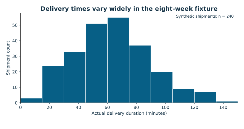
Open the shipment-duration histogram. Read the horizontal axis first: actual delivery time in minutes. Read the vertical axis: shipment count. Then look for center, spread, tail, gaps and more than one cluster. A long right tail could reflect long routes or unusual delays. A second cluster could reflect mixed services. The chart supplies questions to investigate; it does not identify a cause.
Read the diagram explanation
Histogram of 240 synthetic shipment durations, equal 15-minute bins from 0 to 150. Actual times range 6.7 to 136.8 minutes. Source data/shipments_clean.csv.
Next compare groups on a common scale. If East and West each get a panel, use the same axis limits when comparing their distributions. A tall narrow chart and a short wide chart can make the same spread appear different. If you use percentages because group sizes differ, label them as percentages and disclose the group counts.
A worked chart repair
Imagine a slide titled “West wins” with two unlabeled bars, East at 18 and West at 12. Are these minutes, late shipments or percentages? Which weeks? Are the values counts from equal-sized groups? The viewer cannot tell. Suppose the underlying invented counts were 18 late out of 120 East shipments and 12 late out of 120 West shipments. An honest descriptive repair labels them 15% (18/120) and 10% (12/120), uses a zero baseline, and titles the chart “Recorded late rate was 5 percentage points lower at West.”
A footnote then says that route and service mix may differ, so the chart does not measure a causal hub effect. Those numbers are a separate illustration, not the supplied fixture results. Notice that the repaired title still communicates a finding. Honesty does not require making the reader guess what matters.
The chart and the table support each other
A chart makes patterns easier to see. A nearby table makes exact values inspectable and helps readers who cannot use the image. A useful description names the pattern, units, population and important exceptions; “bar chart” is not enough. Avoid relying on red versus green alone. Use direct labels, shapes or line styles, sufficient contrast, and readable text.
A deliberately limited y-axis can be appropriate in a line or dot plot when small differences matter, provided the limits and values are prominent. It becomes misleading when visual area or bar length suggests a much larger ratio. The underlying rule is to preserve the comparison the marks invite the viewer to make. For uncertainty intervals, label whether they represent SD, SE, confidence intervals or prediction intervals; these answer different questions.
Attempt Practice 3A–3C. State what your chosen chart lets a reader compare, then identify one plausible misunderstanding and design it out. Later, you will adapt the same evidence for different audiences without changing the evidence itself.
Further reading: NIST's histogram guide and boxplot definitions.
Read the separate answers and explanations
Reading progress
12 lessons remain open to guests. Marking a lesson read records reading only; it does not award assessment credit or a certificate.
Device reading marks require browser storage. Reading is always available.
Sign in or create an account to save separate account progress. Your current page is kept.
Your earlier place on this device suggests these lessons. No new lesson is marked read.