
Statistics · Module 10
Describe an association without inventing a cause
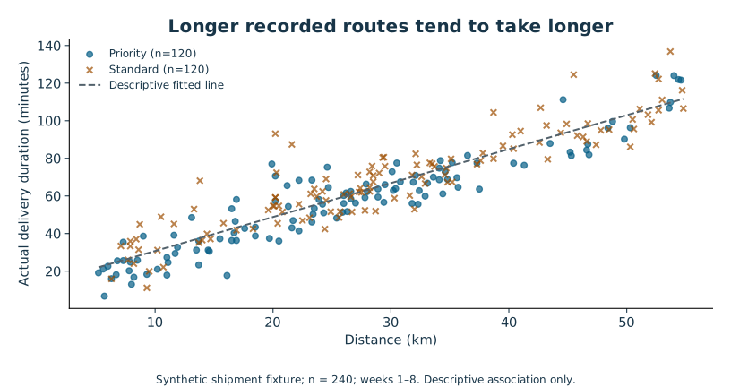
Longer routes tend to take longer in the shipment fixture. A scatterplot makes this relationship visible: each point represents one shipment, distance is on the horizontal axis, and actual minutes are on the vertical axis. It is important to keep the row pairing. Sorting distance and duration separately before correlating them would manufacture a relationship that the original records never contained.
The question now is descriptive: how do recorded distance and recorded time vary together? We are not estimating what would happen if a particular route were redesigned to be one kilometre shorter. That intervention could change traffic, service mix and other conditions beyond the single distance measurement.
Correlation compresses a pattern
Pearson's correlation, r, summarizes the direction and strength of a linear association. It ranges from −1 to 1 when both variables vary. A positive value means larger values of one variable tend to accompany larger values of the other in a roughly straight-line pattern. Changing kilometres to metres does not change r because the measure is unitless.
In this fixture, r is approximately 0.9226 for distance and actual time. That is a strong positive linear association in the observed data. It is not “92% of time caused by distance.” A correlation near zero would not rule out a curved relationship, and a high correlation can be influenced by unusual points or a mixture of distinct groups. Always examine the scatterplot alongside the number.
Read the diagram explanation
Original chart of 240 synthetic shipment records. Scatterplot distance versus actual minutes, descriptive line 12.6622 + 1.8058 × km. Pearson r is 0.9226. No causal inference.
Translate a fitted line into a sentence
A simple least-squares regression fits a straight line by minimizing the sum of squared vertical residuals. A residual is observed outcome minus fitted outcome. For the shipment data, the fitted line is approximately:
Predicted actual minutes = 12.6622 + 1.8058 × distance in kilometres.
The slope says that, within this fitted descriptive model, a one-kilometre difference in distance corresponds to about 1.81 minutes higher fitted mean duration. It does not say that shortening any route by one kilometre would causally save exactly 1.81 minutes. Service mix, weekly conditions and omitted factors can shape the slope.
At 20 km, the fitted value is 12.6622 + 1.8058 × 20 ≈ 48.78 minutes. If a hypothetical observed 20-km delivery took 55 minutes, its residual would be 55 − 48.78 ≈ +6.22 minutes. A positive residual is above the fitted line. That hypothetical observation is for arithmetic practice; it is not an asserted record in the CSV.
The intercept, 12.66 minutes, is the line's fitted value at zero kilometres. The recorded distances run from 5.2 to 54.8 km. Zero lies outside that range, so the intercept need not have a useful operational meaning. Predicting at 100 km would be extrapolation beyond the observed support. A formula can return that number even when the data does not justify using it.
What R-squared says
For this simple least-squares fit with an intercept, R-squared is about 0.8513, equal to r squared. It describes the fraction of the observed outcome variation around its sample mean accounted for by the fitted line, in sample. It is not the fraction of outcomes predicted correctly, a causal fraction, or a guarantee of future performance.
A high R-squared can coexist with systematic mistakes. Perhaps the line is consistently too low for one service type, or the residuals grow with distance. A future-prediction task would also require evaluation on appropriate unseen data and attention to time or group leakage. The earlier Python and SQL courses prepare you to manage that data responsibly; training and evaluating predictive machine-learning models remain outside this course.
Inspect what the line misses
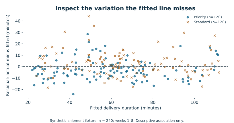
Plot residuals against fitted values and inspect groups and time. A curved pattern suggests the line misses structure. A fan shape suggests changing variability. A time pattern suggests changing conditions or dependence. Extreme residuals deserve investigation. A random-looking plot is useful evidence, but it cannot prove all assumptions.
Read the diagram explanation
Original chart of 240 synthetic shipment records. Residuals actual minus fitted against fitted minutes, distinguished by service with circles and crosses. Shared weekly conditions and omitted service effects limit inference.
For conventional regression uncertainty, assumptions about the conditional mean, independent errors, error variance and distribution matter; their exact role depends on the inferential method. The shipment fixture includes shared weekly conditions and different service mixes, and a one-predictor line omits both. We therefore report its coefficients and R-squared descriptively and do not treat its default slope p-value or confidence interval as an endorsed inference.
Correlation is a starting point for a better question
A common cause can make two variables move together. Hot weather might raise both ice-cream sales and cooling costs; neither variable has to cause the other. Reverse causation and selection can also produce associations. Random assignment can support causal comparison under the study's assumptions, but a scatterplot alone cannot distinguish these explanations.
Attempt Practice 10A–10C. Explain the units of the slope, calculate a fitted value and residual, and write one sentence that clearly separates association from intervention. If your sentence contains “causes,” identify the design evidence that authorizes that word.
Further reading: NIST on scatterplots, NIST on model criticism and residuals, and SciPy's regression result definitions.
Read the separate answers and explanations
Reading progress
12 lessons remain open to guests. Marking a lesson read records reading only; it does not award assessment credit or a certificate.
Device reading marks require browser storage. Reading is always available.
Sign in or create an account to save separate account progress. Your current page is kept.
Your earlier place on this device suggests these lessons. No new lesson is marked read.