
HTML/CSS · Module 7
Build an event grid
Module 07 · 75–105 minutes, provisional
Before you begin: Module 06; layout containers and direct children.
By the end: Use Grid tracks and gaps, explain fractional space, and keep useful source order.
From a row of links to a set of cards
The navigation needed a flexible sequence. Event cards benefit from aligned columns across rows. CSS Grid describes tracks in two dimensions: rows and columns. Flexbox can wrap cards too, but each flex line distributes space independently. Grid is a clearer choice when column alignment is part of the relationship. Neither system is “the newer one that replaces the other”; we use each where its model fits.
In the events section, the event-grid div contains the three article elements. It is a neutral wrapper for layout, while section and article preserve meaning. Set display: grid on this div. Each direct child becomes a grid item. We begin with one column, which is already useful on narrow screens and gives a safe fallback before introducing a breakpoint.
.event-grid {
  display: grid;
  grid-template-columns: 1fr;
  gap: 1rem;
}
.event-card + .event-card { margin-top: 0; }
The adjacent-sibling selector .event-card + .event-card matches a card immediately following another card. In the earlier stacked layout it added margin-top for separation. Grid gap now owns that space, so we reset the old margin to avoid adding two spacing systems together. This is a small example of cleaning up an earlier rule when the layout model changes.
Tracks, gaps, and available space
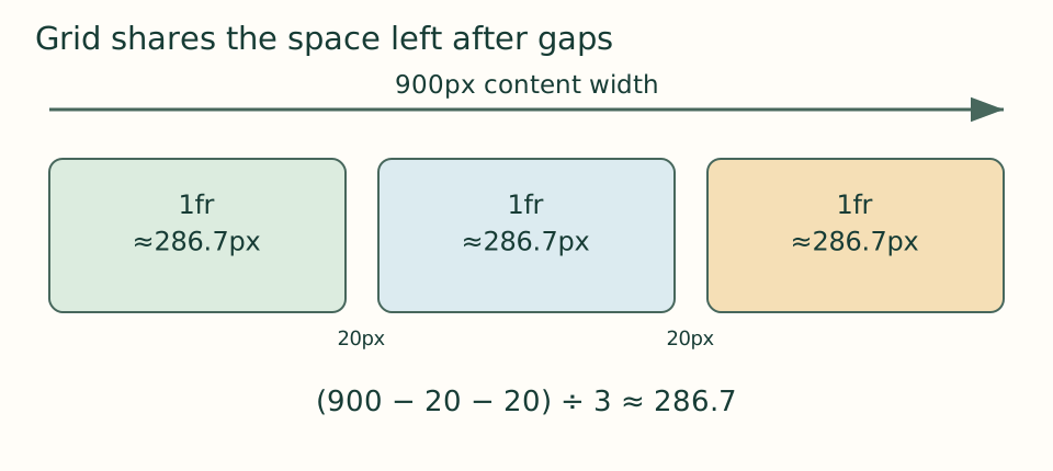
A track is the space between grid lines. grid-template-columns: 1fr 1fr 1fr requests three fractional tracks. fr divides leftover space after fixed sizes and gaps are considered; it is not the same as “one third of the entire viewport.” If a grid’s content width is 900px and its two gaps are 20px each, 860px remains for three equal flexible tracks, about 286.7px each.
 Open the diagram at full size
Read the diagram explanation
At 900 pixels total, two 20 pixel gaps leave 860 pixels. Three equal fractional tracks are about 286.7 pixels each.
For the final wide layout we use repeat(3, minmax(0, 1fr)). repeat avoids typing the same track three times. minmax gives each track a minimum of zero and a flexible maximum. Why allow zero? Content-based minimums can otherwise make a long unbroken item force a column wider than intended. A zero minimum permits shrinking, while sensible text wrapping and a sensible breakpoint keep the result readable.
/* Try temporarily in a wide browser window. */
.event-grid {
  display: grid;
  grid-template-columns: repeat(3, minmax(0, 1fr));
  gap: 1rem;
}
Run the experiment, then restore the safe baseline
In a wide window, temporarily change the column definition to the three-column example. Notice that the cards align. Add a fourth fictional article after story circle, using a new id. Grid automatically places it on the next row in source order. You did not need to assign a row number or hard-code its screen position. Remove the extra article after the experiment, or keep it in a separate practice copy.
Now shrink the window. Three columns quickly become cramped. This is not a reason to make the paragraph font smaller. Restore one column in your main stylesheet; module 08 will apply the three-column rule only when enough space exists. The version 07 checkpoint intentionally remains a single-column grid. Its new value is the layout model and gap, not a dramatic visual makeover.
A second grid for the introduction
The hero introduction has a text group and a figure. Give the hero display: grid, gap: 2rem, and align-items: center. Again, begin with one column. At a wider breakpoint we can allocate 1.1fr to the words and 1fr to the image, giving the text a little more space. Because the first child is the introduction and the second is the figure, their source order remains sensible when they stack.
Grid can place an item across tracks with grid-column, and it supports named areas, but we do not need those features to solve this page. Learning the smallest adequate model helps you avoid fragile placements such as “the second event must always be in column two.” New events, translations, or filters can change how many cards exist.
Inspect the model the browser actually built
Many browser developer tools can show a grid overlay when you inspect the container. Turn it on if available and look for the column lines and gaps. The overlay is a debugging aid, not part of your page. If nothing lines up, first confirm that display: grid is on the parent containing the cards. If the whole events section is the container, its heading and introductory paragraph may become grid items too, which is a different layout.
Checkpoint: open version 07 — download the course ZIP (Extract it and follow the included setup instructions for versions/07/index.html.) and compare source as well as appearance. Explain what changed even if the page still looks mostly stacked. Save a note predicting where the fourth card would go at three columns.
Open the checkpoint source
The runnable-version link shows the result. To inspect or copy its source, use your editor’s Open Folder or Open File command and choose versions/07/index.html inside the extracted course folder. From module 04 onward, also open that version’s styles.css. Keep your own harbor-work folder separate. Compare a small section, then type or transfer it into the corresponding place in your own files; opening a reference does not update your project automatically.
Your next step
Attempt the three practice tasks, then use the separate explained solutions to compare reasoning. Open this module’s runnable version — download the course ZIP (Extract it and follow the included setup instructions for versions/07/index.html.). Technical references are listed in the dated source register.
Read the separate answers and explanations
Reading progress
10 lessons remain open to guests. Marking a lesson read records reading only; it does not award assessment credit or a certificate.
Device reading marks require browser storage. Reading is always available.
Sign in or create an account to save separate account progress. Your current page is kept.
Your earlier place on this device suggests these lessons. No new lesson is marked read.